Customization
It should look like your product.
A chat widget that looks borrowed makes a site feel borrowed. Shape, motion, colour and typography are separate axes here, and every one of them reaches the widget your visitors actually load.
- Nine launcher shapes and nine animations
- Your brand colour through the launcher, the panel and the prompt
- Your brand in the widget — every paid plan drops the "Powered by" line
Drawn from the widget’s own geometry and glyphs, in your brand colour. The motion is in the product.
The launcher and the panel
Six controls, each on its own axis.
Set in steps rather than free-form, so every combination stays legible on any screen.
9 launcher shapes
Circle, speech bubble, rounded square, square, hexagon, diamond, pill, leaf and flower. All nine render on your site, not only in the dashboard preview.
9 launcher animations
From a still classic bubble through pulsing, glowing and morphing, each with its own matching glyph. Resolved on the server, so the preview and the live widget agree.
2 positions
Bottom-right or bottom-left, at a fixed size, with no pixel-offset control — one fewer way to end up with a button over your own navigation.
8 colour themes
Ready-made themes over one brand colour, plus the text and background colours you choose. Your brand colour carries through the launcher, the panel and the proactive prompt.
6 style presets
One click sets colour, shape, animation and typography together, and every axis stays editable afterwards.
4 text sizes, 5 corner steps, 6 typefaces
Six system font stacks, so nothing extra is downloaded into your visitors’ browsers and the panel renders instantly.
Nine animations, each with its own glyph.
Each launcher animation carries its own glyph, and the pairing is resolved on the server — so the animation you picked in the dashboard is the animation your visitors get.
- Still, pulsing, glowing, floating, or morphing.
- Six header treatments for the panel’s top bar, applied inside the installed widget.
- The proactive prompt honours a visitor’s reduced-motion preference.
One brand colour, carried all the way through.
Set your brand colour and it appears on the launcher, the panel header, the visitor’s own message bubbles and the proactive prompt. Eight ready-made themes give you a starting point, and text and background colours are yours to set.
- Eight themes, or your own colour values.
- Light, dark, or follow the visitor’s system setting.
- One colour rather than a palette — every gradient in the widget is derived from it, which is why there is nothing to keep in sync.
In your colour
The same panel, five brands.
Each of these is the running widget with one colour set as the site’s primary — the header, the avatar ring, the composer and the Send button all follow it.
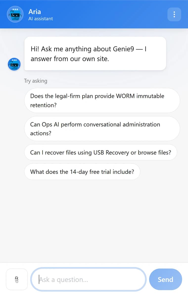
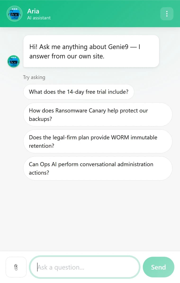
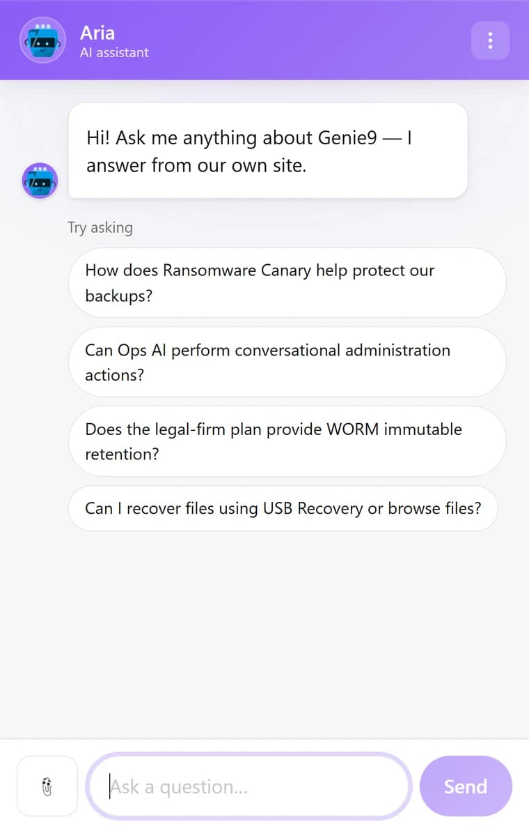
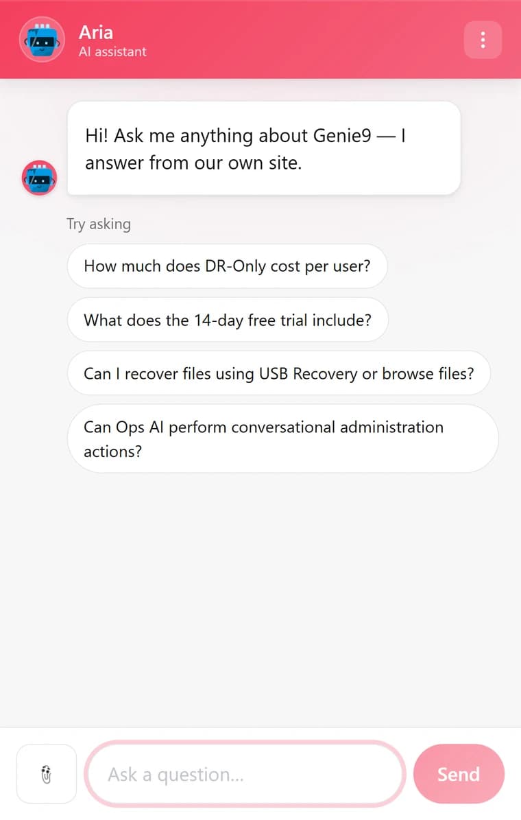
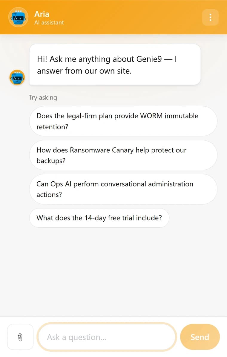
Scroll for more — real captures, one colour each.
Your words, your faces, your CSS
The parts the sliders do not reach.
The greeting
The first line a visitor reads, in your words rather than ours.
The input placeholder
What the composer says before they start typing.
Light, dark, or their system
Pick a theme for the panel, or follow whatever the visitor’s own device is set to.
Custom CSS, scoped to the widget
For the cases the controls do not cover. It is scoped to the widget — the same boundary that keeps your CSS out keeps it in.
The assistant’s name and face
Give the assistant a name for the header, and your logo or an illustrated avatar for its replies. Whatever you choose, it is labelled as an AI assistant — that label is not a setting.
Your team’s names and avatars
When a person replies, the visitor sees their name, their photo or illustrated avatar, and a team label you choose. Show or hide each, per site.
Or hide ours and open the chat from your own button.
Hide the launcher and open the chat from your own code, so the entry point is part of your own design: window.GenieAI.open(), close(), toggle() and isOpen().
- Hide our launcher entirely and drive the panel yourself.
- The same API tears the widget back down again on a route change in a single-page app.
- Give the assistant your own name, avatar and persona — that is what a visitor sees on every reply.
Set it up in a few minutes.
The free plan gives you every appearance control. Change the shape, watch the preview, and put it on your site.